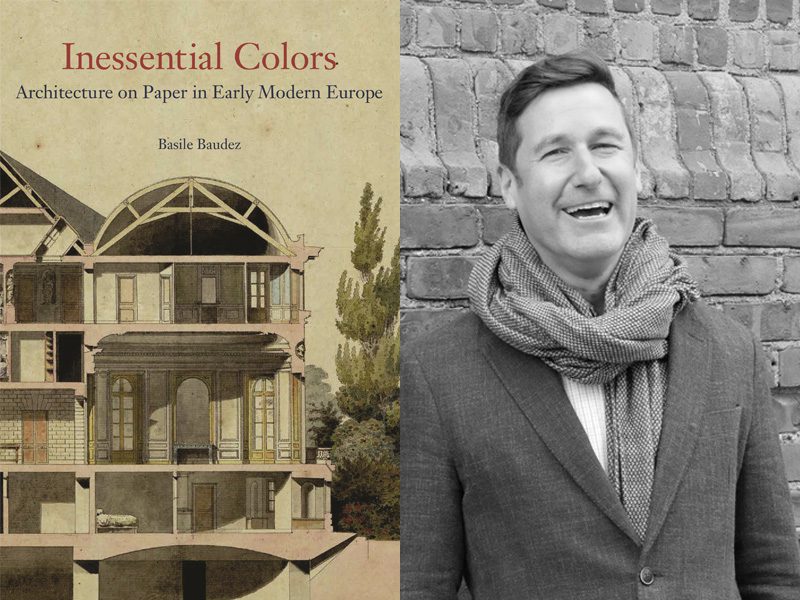
Basile Baudez is Assistant Professor of Art and Archaeology and George H. and Mildred F. Whitfield Preceptor in the Humanities. His book “Inessential Colors: Architecture on Paper in Early Modern Europe” was published December 21, 2021 by Princeton University Press.
How did you get the idea for this project?
It evolved quite naturally. My first book dealt with the birth of architectural schools in 18th-century Europe. Because their formal curricula relied almost exclusively on the mastery of draftsmanship, I wanted to understand the conventions proper to architectural representation that students had to learn. Among these conventions, color stood out as both the most visible and the least obvious: architectural drawings are primarily monochrome. To understand how color conventions became part of the language of architects in the 18th century, I had to go back in time and question the difference between these chromatic signs and those that are there purely to enliven the page and do not carry architectonic information. Establishing the genealogy of the use of color in architectural representation allowed me to identify and map national traditions of representing architecture in early modern Europe.
How has your project developed or changed throughout the research and writing process?
Historians of color tend to focus on questions of materials, notably pigments and dyes, and optical theories. While I incorporated these essential aspects into my research, I decided at one point that it was more important to give the materials their own space, in an Appendix, that describes the processes and tools. This way, anyone interested in the materiality of color on paper in early modern Europe could refer to this independently. I also opted to limit the discussions on the second issue of optical theories as I discovered that they played a very small part in the story I wanted to tell. Because what interests me is the role that color played in graphic communication, in the end I restrained the corpus to presentation drawings, at the expense of working drawings or sketches. In the vast majority of these, the use of color comes from a need to communicate with a client that is not accustomed to the specificities of architectural language. That decision led me to introduce and discuss other media including fabrics and colored prints that in some situations – seventeenth-century Amsterdam, late eighteenth-century France for example – overlap with the concerns behind the production of architectural drawings. This allowed me to break the isolation in which architectural have been largely considered until now, tying them to a host of other practices.
What questions for future investigation has the project sparked?
The book aims to reconsider architectural drawings and prints as objects to be discussed on their own terms and not simply as steps towards a built project. I hope that the book will generate studies on other graphic conventions adopted by architects, such as shading, hatching, or dotted lines. Another exciting avenue that this research hopes to inspire is the relation between the use of color on paper and in the built environment, notably for the modern period.
Why should people read this book?
First, because it is gorgeous! Flipping through the pages of the book allows the reader to reconsider the long-held prejudices against architectural drawings. One can now appreciate their extraordinary beauty and the efforts architects have made to capture our attention and appeal to our sense of beauty. Second, because it offers a model to rethink the role of color in abstract representations, like plans, and imitation of the visible, like elevations. Third, because it sheds a new light on the birth of the architectural profession, in dialogue with painters, mapmakers, surveyors, and engineers, a history that still resonates today in a field that is perpetually striking a balance between art and science.
Learn more about other publications by Princeton University faculty in the humanities by exploring our Faculty Bookshelf.

